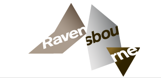

Ok so Rave have a new logo... fair enough .... some people don't like it... some people have grown to accept it.... what I want to know... is .... why can't they STICK with ONE logo... and not just get some child to make another version? THEY AREN'T EVEN BEING CONSISTENT NOW.... come on.... do you want to be treated as a joke?!
Note - look at the angle of the third triangle across to the right - doesn't match. Both taken from 'RAVE' websites.... PAH! This annoys me a little - we are considered to be people graduating from a PROFESSIONAL institution that doesn't one Logo... but a few triangles you put together and HOPE it will look like what symbolises Ravensbourne - I duno if anyone else has noticed ... but nevermind. My rant is over... for now.
Next up THIS will be the logo - ' ||| ' - can't you see - its the logo from the side?
ok... NOW the rant is over.


No comments:
Post a Comment